Data Dashboards at State DOTs
Case Studies of Select Transportation Agencies
January 2021
FHWA-HEP-19-032

Prepared for:
Office of Planning
Federal Highway Administration
U.S. Department of Transportation
Notice
This document is disseminated under the sponsorship of the Department of Transportation in the interest of information exchange. The United States Government assumes no liability for the contents or use thereof.
The United States Government does not endorse products or manufacturers. Trade or manufacturers’ names appear herein solely because they are considered essential to the objective of this report.
| REPORT DOCUMENTATION PAGE |
Form Approved
OMB No. 0704-0188
|
| Public reporting burden for this collection of information is estimated to average 1 hour per response, including the time for reviewing instructions, searching existing data sources, gathering and maintaining the data needed, and completing and reviewing the collection of information. Send comments regarding this burden estimate or any other aspect of this collection of information, including suggestions for reducing this burden, to Washington Headquarters Services, Directorate for Information Operations and Reports, 1215 Richmond Highway, Suite 1204, Arlington, VA 22202-4302, and to the Office of Management and Budget, Paperwork Reduction Project (0704-0188), Washington, DC 20503. |
| 1. AGENCY USE ONLY (Leave blank) |
2. REPORT DATE
January 2021 |
3. REPORT TYPE AND DATES COVERED
Feb 2020-Jan 2021 |
4. TITLE AND SUBTITLE
Data Dashboards at State DOTs:
Case Studies of Select Transportation Agencies |
5a. FUNDING NUMBERS
HW2LA5 SF025
|
6. AUTHOR(S)
Scott Gilman ORCID 0000-0002-5966-8377
Patricia Cahill ORCID 0000-0003-4713-5757 |
5b. CONTRACT NUMBER |
7. PERFORMING ORGANIZATION NAME(S) AND ADDRESS(ES)
U.S. Department of Transportation
John A. Volpe National Transportation Systems Center
55 Broadway
Cambridge, MA 02142-1093
|
8. PERFORMING
ORGANIZATION REPORT NUMBER
DOT-VNTSC-FHWA-21-03 |
9. SPONSORING/MONITORING AGENCY NAME(S) AND ADDRESS(ES)
U.S. Department of Transportation
Federal Highway Administration
1200 New Jersey Avenue, SE
Washington, DC 20590 |
10. SPONSORING/MONITORING AGENCY REPORT NUMBER
FHWA-HEP-21-009 |
| 11. SUPPLEMENTARY NOTES |
12a. DISTRIBUTION/AVAILABILITY STATEMENT
This document is available to the public on the FHWA website at https://www.gis.fhwa.dot.gov/.
|
12b. DISTRIBUTION CODE |
13. ABSTRACT (Maximum 200 words)
In supporting State Departments of Transportation (DOTs) and metropolitan planning organizations (MPOs) in using Geographic Information Systems, the Federal Highway Administration (FHWA) is publishing this Case Study Report focusing on the use of online, geospatial dashboards by transportation agencies to analyze and display operational metrics and performance targets. To gather information for this report, the U.S. DOT Volpe National Transportation Systems Center interviewed five State DOTs and one consultant and developed a case study focusing on their experiences. The purpose of this document is for State DOTs and MPOs to consider the approach that these agencies have used in developing dashboard projects to reduce a duplication of efforts and learn best practices from peer agencies. |
14. SUBJECT TERMS
Geographic Information Systems (GIS), Dashboards, Collaboration, Data Visualization |
15. NUMBER OF PAGES
22 |
| 16. PRICE CODE |
17. SECURITY CLASSIFICATION OF REPORT
Unclassified |
18. SECURITY CLASSIFICATION OF THIS PAGE
Unclassified |
19. SECURITY CLASSIFICATION OF ABSTRACT
Unclassified |
20. LIMITATION OF ABSTRACT
Unlimited |
NSN 7540-01-280-5500
Standard Form 298 (Rev. 2-89)
Prescribed by ANSI Std. 239-18
298-102
Acknowledgements
The Federal Highway Administration and the U.S. Department of Transportation Volpe National Transportation Systems Center would like to thank the participating agencies and interviewees that made this case study report possible. The participating agencies are listed below and the particular individuals who took the time to be interviewed for this report are listed in Appendix A: Case Study Participants.
- Arkansas Department of Transportation.
- Michigan Department of Transportation.
- Montana Department of Transportation.
- Oklahoma Department of Transportation.
- Puerto Rico Department of Transportation and Public Works.
Contents
List of Abbreviations
| Abbreviation |
Term |
| AASHTO |
American Association of State Highway and Transportation Officials |
| ADA |
Americans with Disabilities Act |
| ARDOT |
Arkansas Department of Transportation |
| DOT |
Department of Transportation |
| DTOP |
Puerto Rico Department of Transportation and Public Works |
| FHWA |
Federal Highway Administration |
| GIS |
Geographic Information Systems |
| GIS-T |
Geographic Information Systems for Transportation |
| MAP-21 |
Moving Ahead for Progress in the 21st Century Act |
| MDOT |
Michigan Department of Transportation |
| MDT |
Montana Department of Transportation |
| MPO |
Metropolitan Planning Organization |
| ODOT |
Oklahoma Department of Transportation |
| TMC |
Traffic Management Center |
| USDOT |
United States Department of Transportation |
1 Introduction
1.1 Background
FHWA Strategic Plan Goals and Objectives
- Safety – Reduce transportation-related fatalities and serious injuries across the transportation system.
- Infrastructure – Invest in infrastructure to ensure mobility and accessibility and to stimulate economic growth, productivity, and competitiveness for American workers and businesses.
- Innovation – Lead in the development and deployment of innovative practices and technologies to improve the safety and performance of the Nation’s transportation system.
- Accountability – Serve the Nation with reduced regulatory burden and greater efficiency, effectiveness, and accountability.
In 2018, the United States Department of Transportation (USDOT) published a Strategic Plan.1 The Plan included goals that address safety, infrastructure, innovation, and accountability within the Federal Highway Administration (FHWA). FHWA’s Geographic Information Systems (GIS) in Transportation program promotes the use of GIS among State Departments of Transportation (DOTs) to more efficiently manage the country’s transportation system and achieve the Department’s strategic goals.
GIS-enabled data dashboards can help State DOTs accomplish all of these strategic goals, and two in particular: innovation and accountability. Data dashboards promote innovation by allowing agencies to more easily incorporate new technology and large, real-time datasets in their decisionmaking. Data dashboards promote accountability by presenting details on an agency’s operations and goals to internal stakeholders and the general public. This case study presents five exemplary uses of data dashboards that allow agencies to meet USDOT and their own strategic goals.
1.2 Purpose and Methodology
This report is part of the GIS in Transportation case study series. FHWA designed the series to highlight exemplary uses of GIS across State DOTs and metropolitan planning organizations (MPOs) that allow other agencies to stay apprised of current practices in the field, learn about best practices for GIS applications, and become familiar with innovative practices in the GIS for transportation field. The case studies also provide agencies with points of contact at other agencies for help on implementing similar solutions.
The goal of these case studies is to help State DOTs interested in implementing data dashboards by answering the following research questions:
- For what purpose do State DOTs design and use data dashboards?
- How do State DOTs effectively design data dashboards? Which stakeholders do they involve, and what technology do they use?
- How effective have dashboard projects been at helping State DOTs accomplish their goals?
The GIS in Transportation Program identified the topic of data dashboards as an area of growing interest among State DOTs and MPOs through the GIS for Transportation (GIS-T) 2019 Survey administered by American Association of State Highway and Transportation Officials (AASHTO).
Through the same AASHTO survey, the GIS in Transportation Program team identified several State agencies that have experience using data dashboards to improve transportation operations. The team conducted further research into the list of transportation agencies identified and selected agencies that had significant experience with dashboards. The following agencies were willing and available for interviews:
- Arkansas Department of Transportation (ARDOT).
- Michigan Department of Transportation (MDOT).
- Montana Department of Transportation (MDT).
- Oklahoma Department of Transportation (ODOT).
- Puerto Rico Department of Transportation and Public Works (Departmento de Transportación y Obras Públicas; DTOP).
The team also spoke with a private consultant, Metric Engineering, LLC of Puerto Rico, to learn more about the data collection and dashboards efforts in Puerto Rico. Metric Engineering works in partnership with the Special Projects and Design Department of Puerto Rico Department of Transportation and Public Works to collect, analyze, and visualize data related to their dashboard projects.
Representatives from each of the identified transportation agencies were generous enough to provide one hour of their time for a phone interview with the research team. Agency representatives were the most knowledgeable staff on how data dashboards are developed and used within their organizations. The research team developed a standardized interview guide, which can be found in Appendix A: Case Study Participants, to use for each of the interviews. This allowed the research team to guide each interview consistently among agencies and produce consistent information that can be compared between respondents.
1.3 Definition of Dashboard
A dashboard is a visual display of information on an organization’s operations that help managers, analysts, and other employees align their decisions with the organization’s goals. Usually, dashboards are accessible to multiple decisionmakers with different needs. Sometimes dashboards are accessible to the public to allow them to provide feedback. Dashboards often include information for context, such as past data, future trends, or comparisons to similar organizations.
There are several different types of dashboards:2
- Tactical or analytical dashboards provide in-depth analysis on a particular process, event, or detail. They combine large, often real-time datasets into an interface that allows analysts and subject matter experts to drill down and extract insights relevant to their responsibilities. Often, these dashboards replace manual, repetitive analysis tasks.
- Operational dashboards monitor an agency’s processes or operations to help managers with their day-to-day decisions. Usually, a business owner or project manager will use an operational dashboard to monitor their team’s essential functions in real-time.
- Strategic dashboards monitor long-term strategies by analyzing and benchmarking trend-based information. Users include executives or departmental directors who are responsible for aligning their organization’s activities with long-term goals. A key feature of strategic dashboards is the ability to compare an organization’s performance with stated goals.
- Informational dashboards are an educational tool to provide an overview of a topic or organization to a public audience.
1.4 History of Dashboards
First used in 1846, the word “dashboard” originally meant the board or leather apron on the front of a vehicle that kept mud from splashing in the interior. Its first association with data displays followed the first automobiles. Without the safety and control systems of today, drivers required analog dials to measure electrical current, fuel levels, and oil levels of their vehicle. Airplanes adopted dashboards as well, eventually allowing for instrument flying, or navigation using only an airplane’s instrument rather than the pilot’s sight. Airplane dashboards became more complex and eventually allowed for centralized control of an entire fleet.3
Although data dashboards have their origin in transportation, they were first applied in an organizational context to financial markets. Innovative Market Systems, a data services company owned by Michael Bloomberg, used some of the first data dashboards in 1982; these dashboards provided multi-screen displays with real-time and historical data regarding equities, fixed-income assets, and derivatives, along with financial news and current events. Dashboards became more widespread in the 1990s during the business intelligence movement, in which corporations developed data warehouses analyzing their supply chain issues, customer relations, and other issues. Today, over 40 percent of the world’s 2,000 largest companies have implemented some sort of dashboard system.4
Public sector agencies, including transportation agencies, have followed the private sector’s lead on using dashboards. Dashboards in the public sector have risen in popularity in recent years due to advancements in technology and business practices. The Federal Government has spurred the adoption of performance metric reporting, and many State and local agencies have adapted to this requirement with dashboards. Dashboard development is easier and cheaper today than ever before due to advancements in web and data visualization technology, making dashboards a technical and financial possibility for a wider range of public sector agencies.
Whether used in an automobile, a financial terminal, or a department of transportation, all dashboards provide multiple, real-time streams of information, critical short- and long-term performance, and present them in a way that key decisionmakers can easily understand and act on. Using dashboards in a public sector setting has unique considerations, however: while nearly all of the information necessary for operating a car or trading stocks is quantified, public sector agencies often have to consider uncertain or unquantifiable information into their decisions as well, such as stakeholder feedback or incomplete demographic information. As a result, public agencies can rarely make their decisions completely using only a dashboard.
1.5 Best Practices for Design and Implementation
Dashboard Best Practices
- Know the audience and their needs.
- Design as simply as possible.
- Use visual hierarchy to make important information stand out.
- Include relevant stakeholders from the beginning of the design and implementation process.
With dashboards now used across many sectors, there are many established best practices for designing, developing, and implementing data dashboards. There are three primary considerations when designing and developing a data dashboard:
- The audience;
- The design; and
- The design process.
One important consideration is identifying and understanding the dashboard’s audience. As mentioned above, dashboards often have multiple audiences, including managers, subject matter experts, and external stakeholders. Most audiences will have similar needs, such as identifying overall trends within an organization. Aside from understanding trends, most users need information specific to their role or department; for example, engineers may need detailed technical information while managers may need information on their specific personnel. Dashboards allow users to find their own information through interactivity such as filtering and drill-down capabilities. A key factor in dashboard success is the ability for users to see themselves in the data, and to understand how they fit into the overall organizational trends. Instead of attempting to provide any piece of information that might be helpful to a target audience, dashboards provide targeted information for clearly defined audiences and the questions they need to answer to perform their jobs. Furthermore, dashboard developers should understand what environment they will use to view the dashboard (i.e., in a browser, on a mobile device) and their technical competence. Often, adapting to the dashboard’s audience requires iterative cycles of prototyping and feedback.5
Second, dashboards should employ established principles of graphic design. The first and perhaps most important principle is simplicity.6 Any organization has many more data streams than is possible to show on a single dashboard. If a dashboard is too crowded, it becomes confusing and difficult to use, reducing its value to users. Dashboards should be as simple as possible, and what is displayed on a dashboard should be limited to only what is necessary for dashboard users.
Designers should use visual hierarchy to structure the dashboard. In a visual layout, users perceive elements that are larger, brighter, bolder, or otherwise stand out first.7 Designers should use principles of visual hierarchy to highlight overall trends relevant to all users, then make more detailed information less apparent so that only users that are looking for it have to process it. Finally, through visual hierarchy, text instructions or other visual elements, the dashboard should provide some indication of how to use it—where to start, what pieces are interactive, etc.
Third, it is important to remember that dashboards usually are paired with changes in business processes that will affect users’ responsibilities, control, and accountability.8 As a result, it is important to include stakeholders from the beginning to ensure that the dashboard meets their needs, and to ensure maximum buy-in for effectiveness once it is deployed.
The case studies and analysis in this report examine how agencies incorporate these best practices into their dashboards and adapt them to the unique context of transportation agencies.
↑ Return to Top
↑ Return to Table of Contents
2 Agency and Project Profiles
Interviews with Arkansas DOT, Michigan DOT, Montana DOT, Oklahoma DOT, and Metric Engineering, LLC of Puerto Rico explored the ways these agencies use data dashboards to collect, analyze, and visualize data. Each of these agencies uses GIS tools to engage with, and communicate information to, internal and external stakeholders via these dashboards. Some agencies used internal data dashboards primarily for information gathering, while others used external data dashboards to communicate to the public about ongoing projects and to solicit information about missing data points. Each project’s unique goals shaped how the respective agencies collected and visualized data. All interviewees expressed satisfaction with how data dashboards have improved information sharing and project management within their agencies.
These profiles identify key components of each agency’s approach to data dashboards, including basic information on their projects, agency structures, and the challenges they faced in launching these programs.
2.1 Arkansas Department of Transportation (ARDOT)
The Arkansas Department of Transportation (ARDOT) is a multimodal transportation agency responsible for over 16,000 miles of highway. The ARDOT GIS Division sits within the Transportation Planning and Policy Division and is responsible for creating, updating, and maintaining over 500 maps for the State, County, and the State Highway Division of ARDOT. The GIS Division within ARDOT oversees the Arkansas Crash Analytics Tool (ACAT); the Traffic Safety section team within the Transportation Planning and Policy Division created the tool and is responsible for updating and maintaining it.
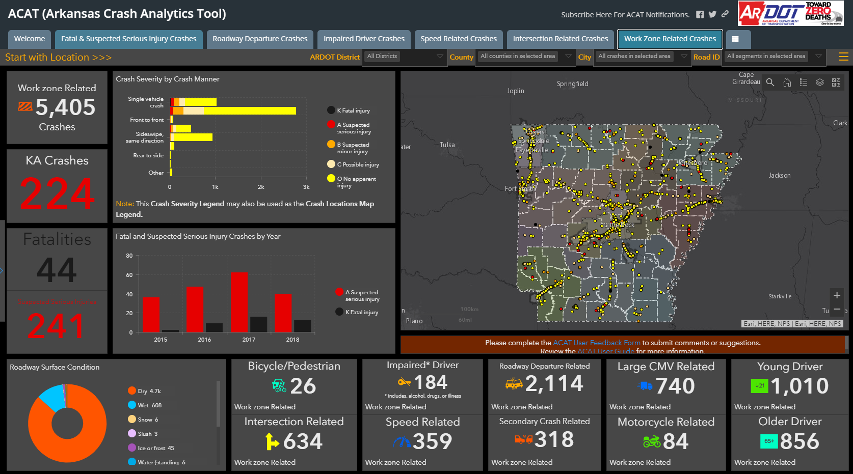
Figure 1. Illustration. ARDOT’s Arkansas Crash Analytics Tool (ACAT) visualizes and maps crash data in the State of Arkansas. This screenshot from July 2020 displays work zone-related crashes.
The Traffic Safety team created ACAT to organize crash analytics data, including crash records and other reports, for the purpose of identifying, evaluating, and planning the safety enhancement of potential crash sites, hazardous roadway conditions, and railway-highway crossings. ACAT contains information for the most recent five years. Previously, ARDOT maintained a similar internal tool that required the team to make individual data queries for each request, download results to CSV files, and deliver them to each requester. The new dashboard enables users to find information in real-time without making individual queries. External organizations, including MPOs, other transportation organizations, local government offices, and police departments also use ACAT, as do colleges, universities, and private citizens.
The Arkansas State Police collects the crash data displayed in ACAT. The Traffic Safety team created a memorandum of understanding with the State Police to enable ARDOT access to the crash data and to create ACAT. ARDOT cleans the crash data to remove any personally identifying information before uploading the data into ACAT.
ACAT is highly utilized both within ARDOT and by ARDOT stakeholders. The Transportation Planning and Policy Division uses ACAT to create targets for different safety programs and to identify areas of safety improvement across the State. For example, ACAT enables the Division to locate high-risk locations quickly and provide the necessary information to the Division so it can begin research projects that address those safety concerns. ACAT has been the first step in implementing safety projects to install cable barriers, rumble strips, and signalized intersections, among others. Local police jurisdictions use ACAT to identify areas at high risk for traffic incidents and deploy officers accordingly. The ACAT tool has drastically changed how ARDOT and its stakeholders can request data and make informed decisions based on that data. Stakeholders maintain the ability to request specific datasets from ARDOT, though those requests have decreased since the creation of ACAT.
After the Traffic Safety team launched ACAT, they received a high volume of feedback from stakeholders about the information displayed. Users identified missing data points and reported them to the team for inclusion, which led to improved data collection and analysis. The Traffic Safety team reports that local knowledge, shared through public feedback on ACAT, has informed their processes and helped the team improve the maintenance and performance of the dashboard.
ACAT has also resulted in unintended benefits, such as increased engagement with ARDOT stakeholders about the data. For example, ARDOT found that crash reporting from local enforcement agencies has improved since the launch of ACAT. The Transportation Planning and Policy Division and Traffic Safety team have received more requests by local enforcement agencies on the proper methods of completing online crash reports since launching ACAT; the online crash report system, ECrash, is not mandatory, but the team has observed increased adoption and use of the system since local jurisdictions have had access to ACAT. The increased use of this tool results in more available crash statistic data, which improves ACAT’s performance.
2.2 Michigan Department of Transportation (MDOT)
The Michigan Department of Transportation (MDOT) is responsible for overseeing the air, shipping, and freight operations and infrastructure across the State, and for the maintenance and operations of the Michigan State Trunkline Highway System, which includes all Interstate, U.S., and State highways in Michigan. MDOT’s GIS Unit leads over 160 ArcGIS Online projects on data dashboards and sits within the Bureau of Transportation Planning. The GIS Unit is responsible for all geospatial data for MDOT, including supporting field data collection and the deployment of all Esri technology.
MDOT uses over 100 of their 179 dashboards regularly for the operations, special projects, and other efforts within the Agency. Three major dashboard projects at MDOT include:
- Bridge Conditions Dashboard, which tracks bridge conditions across the State;
- Billboard Dashboard,9 which tracks the lifetime of permits for billboards on MDOT’s right-of-way; and
- Project Management Dashboard, an internal dashboard that tracks MDOT dashboard usage.
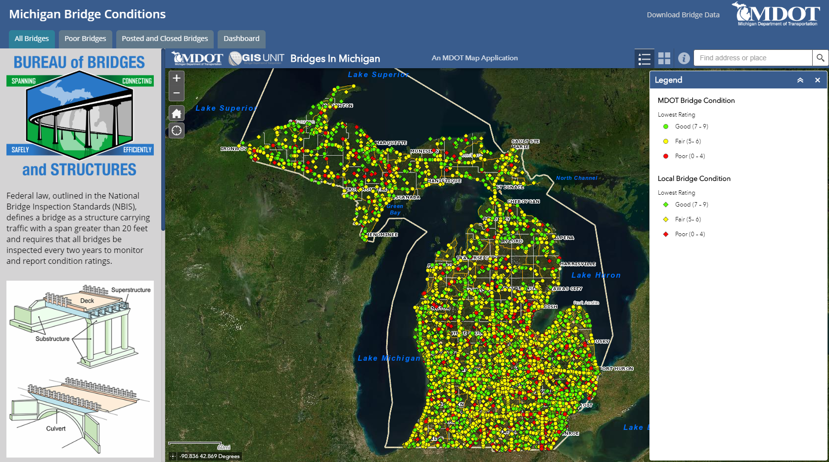
Figure 2. Illustration. MDOT’s Michigan Bridge Conditions dashboard displays bridge conditions throughout the State. Users can zoom in and click on individual bridges for more detail.
The GIS Unit created these dashboards to fulfill multiple agency goals and created some in collaboration with (or at the request of) other departments. MDOT takes on GIS projects for almost every Agency department and has recently begun discussion with other State departments to undertake collaborative projects. One of the most successful DOT projects stems from a request by the MDOT Bureau of Bridges & Structures. The Bureau requested that the GIS Unit create the Bridge Conditions Dashboard to track infrastructure conditions for State and Federal reporting. MDOT has since used the dashboard to inform applications for State and Federal funding for bridge improvements and maintenance.
MDOT’s GIS Unit includes seven full-time staff and an average of five student staff each semester. MDOT’s student staff served as project leads in collecting the data feeding the Billboard Dashboard, an internal project that now informs MDOT of expiring permits for billboards on MDOT property. Before this dashboard, MDOT tracked permit expirations via spreadsheet; this new system enables a more efficient system to visualize and track billboard permitting.
MDOT’s dashboards are highly utilized, both within and outside the Agency. MDOT created an internal Performance Management Dashboard to track the usage of all their active dashboards. In conjunction with feedback collected by the department, MDOT uses this information to improve the performance of their dashboards through identifying best practices and areas of improvement. Due to the past success of these dashboard projects, MDOT continues to receive requests for collaborative projects both from other departments within MDOT and from other public entities such as the Michigan Department of Technology Management and Budget, the Michigan State Police, and the Michigan Department of Environment, Great Lakes & Energy.
The GIS team mostly relies on data created and owned by the Agency to create dashboards, but—as in the Billboard project—the time and expertise of the unit is used to complete field collection efforts when Agency data is not available. MDOT primarily uses these dashboards to track progress on projects rather than to create maps and visualizations.
The GIS Unit works very closely with all project requesters to ensure the successful creation and implementation of their projects. One of the greatest lessons learned from the team’s experience with creating these dashboards has resulted in a streamlined request process for other MDOT departments and departments outside the DOT. The team found that the simplest way for departments to request dashboards is through PowerPoint presentations that walk the GIS team through the purpose and functionalities of the requested dashboard. This system has greatly increased the speed with which MDOT can create dashboards as the team no longer needs to start at the beginning when responding to a request. The GIS team often makes recommendations on the best user interface and works with the DOT Office of Communications team for styling and visualizations.
MDOT continues to invest in these dashboards, as shown in the new dashboards that come online each year. The GIS team’s most recent challenge is providing mobile device functionality to all dashboards and maps created by the department, identified by the team as an area of focus for 2020. MDOT’s work on dashboards has improved not only the data and project tracking for the Agency and its partners, it has also provided great benefits to the business areas using the technology to support their workflows. The use of dashboards has highlighted significant business benefits to MDOT and has featured the critical role and unique skills of the GIS Unit. The GIS Unit is looking forward to continued partnerships across MDOT and the State of Michigan.
2.3 Montana Department of Transportation (MDT)
The Montana Department of Transportation’s (MDT) Geospatial Information Section developed a dashboard to display MDT’s construction and maintenance projects on an interactive map. The Geospatial Information Section is a team of eight analysts and specialists reporting to one supervisor. The team exists within MDT’s Data & Statistics Bureau in the Rail, Transit, and Planning Division. One lead GIS analyst was primarily responsible for developing the dashboard, with support from the rest of the team.
MDT created the dashboard to better accommodate requests for performance reports on construction projects. Specifically, Montana’s Transportation Commission requested a report of all upcoming transportation-related projects. MDT receives several requests of this nature every year. Previously, the reports required a multi-day, agency-wide effort to fulfill due to inefficient storage of data and decentralized project information, among other logistical challenges. MDT stored their data on past, present, and future projects in three different databases and had to collect project details, such as finance and technical information, from different departments across the Agency. As a result, compiling a comprehensive list took much more effort than simply producing a report from a single database. The Transportation Commission and the Planning Division administrations identified an opportunity to save time and effort with a new process.
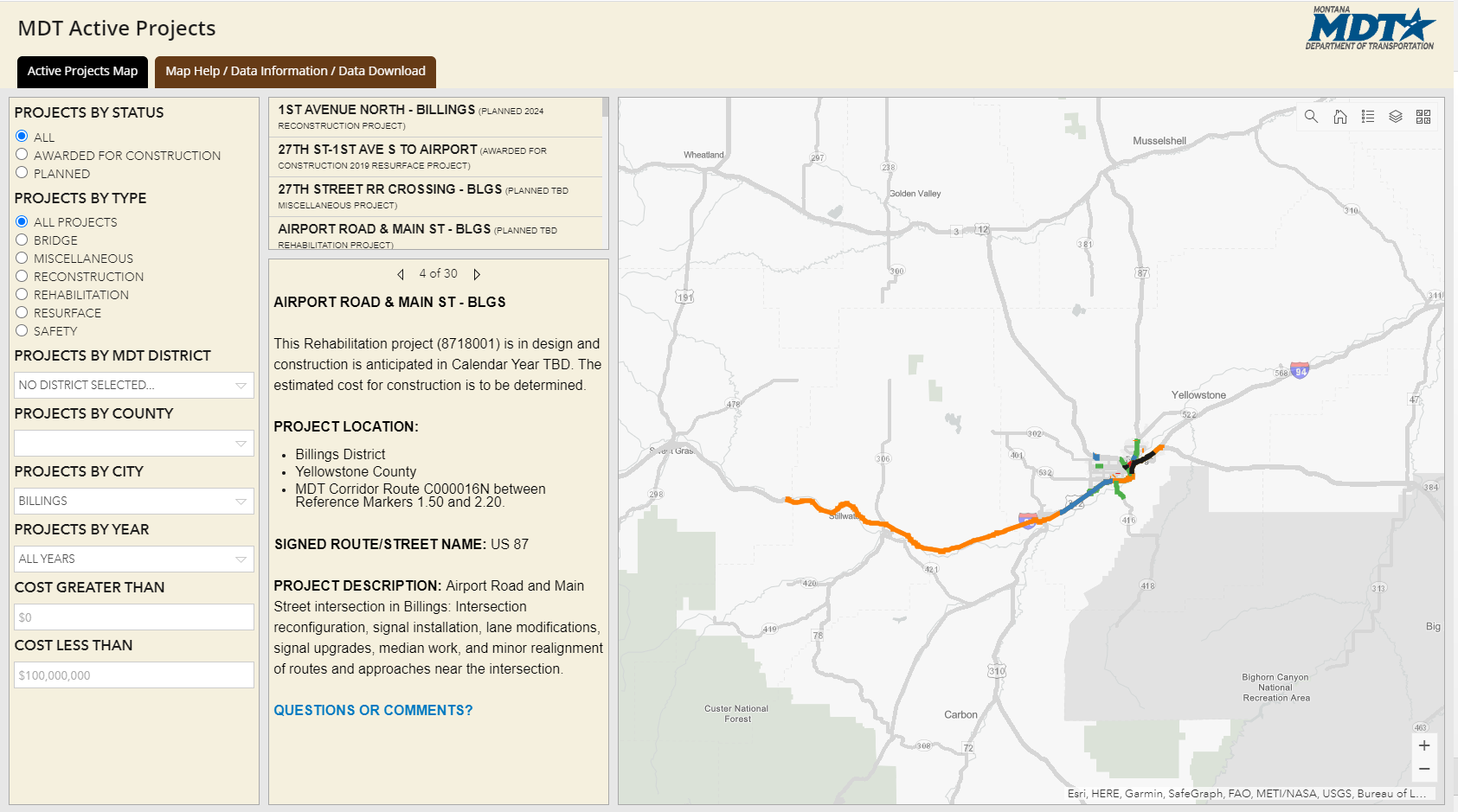
Figure 3. Illustration. MDT’s Active Projects Dashboard allows users to view, filter, and find details on active construction and maintenance projects throughout the State. In this screenshot, the user has filtered for projects in the City of Billings.
Several stakeholders, including representatives from the Planning, Engineering, and Information Services Divisions, met to scope out a tool to simplify the reporting process. Early attempts were unsatisfactory until a prototype dashboard using ArcGIS Online templates with sample data was made. A working prototype that demonstrated possible use of the dashboard catalyzed the active participation of other stakeholders. The development team met with the Engineering, Administration, and Planning Divisions’ leadership to gather construction and financial data and to discuss how best to display it on the dashboard. The team took approximately one year to meet with the appropriate internal stakeholders and approximately six months to develop the final tool, including iterative rounds of feedback and revisions. Every month new data is imported from across several departments to maintain the dashboard’s comprehensive record of MDT’s planned construction and maintenance projects across Montana.
The project team encountered some challenges with stakeholder involvement. As an interdepartmental initiative, the project required input from Agency leadership, but the development team found it challenging to meet with them given their limited availability. Additionally, MDT’s Information Technology (IT) department participated in scoping other dashboard technologies. When the development team reached the final stages of the dashboard, IT and the communications team reviewed it for public use.
The team also encountered some challenges regarding the dashboard’s design and development. For example, due to the high profile and public facing nature of the dashboard, the team had to learn and comply with required Americans with Disabilities Act (ADA) standards for their web design. Furthermore, the team had to determine what internal agency data was appropriate to show to the public. Fluctuations in a project’s costs, due to changes in material costs or estimated labor costs, could be misleading for public users that do not understand the cause of such fluctuations. Project engineering descriptions were also included in the webmap, but were written in technical jargon that was incomprehensible to the general public. The project team overcame this challenge by asking the Engineering Division to rewrite project descriptions in everyday language. Now, all engineering project managers write descriptions in plain language, which has simplified internal communication as well.
A number of lessons were learned from this project. The project team noted that having a dedicated project manager would have helped them with engaging all stakeholders through scheduling meetings and following up with leadership and IT. The project team also learned the importance of managing stakeholder expectations from the beginning, specifically letting stakeholders know early on that developing a dashboard is a long, structured process that requires several cycles of prototyping, feedback, and revisions.
The Geospatial Information Section does not receive many direct comments on the dashboard because the Engineering Division collects public comments related to construction projects. However, the team has received positive feedback from administrators, deputy directors, and the Agency director. Furthermore, MDT has not received as many requests for project information since the launch of the dashboard as users can now explore the data on their own. As a result, MDT can save time on requests the dashboard cannot address.
2.4 Oklahoma Department of Transportation (ODOT)
The Oklahoma Department of Transportation (ODOT) is responsible for construction and maintenance of 30,000 miles of non-tolled highway lanes and nearly 6,800 bridges. ODOT also administers State and Federal funding used on city and county road and bridge projects. The ODOT GIS team has rapidly gained experience in using data dashboards to track project progress, maintain asset inventories, and evaluate team performance metrics.
Three publicly maintained dashboard projects from ODOT include:
- Asset Inventory Dashboard: ODOT’s newest dashboard is a story map that displays the assets owned and operated by ODOT. The assets displayed in the map include signs and signals, rumble strips, and other physical infrastructure.
- County Certification Mileage Dashboard: Counties, the primary users of this dashboard, can use this dashboard to collect up-to-date information on their road mileages, including privately maintained roads and those that are eligible for credit with the State.
- Performance Measures Dashboard: This dashboard displays information about key performance measures within ODOT, including the performance of physical assets like pavement conditions and metric related to public safety. This dashboard improves transparency for the Department and enables internal and external stakeholders to access easily digestible information on the goals and metrics ODOT is using to improve performance.
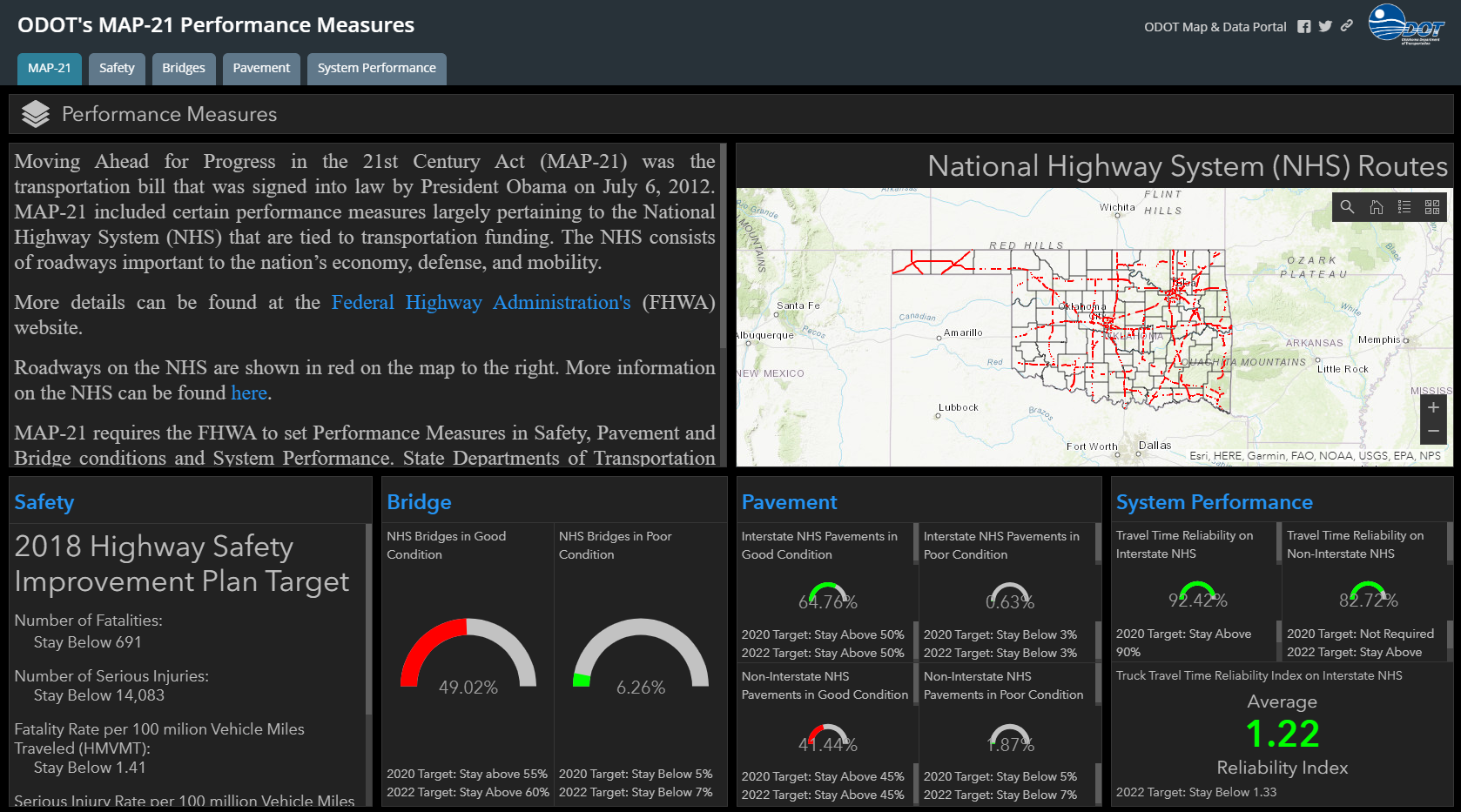
Figure 4. Illustration. ODOT’s MAP-21 Performance Measures displays key metrics for the National Highway System in Oklahoma. The dashboard allows users to see metrics for performance areas and assets using the tabs.
These dashboards draw information primarily from databases that ODOT already maintains. For example, the Performance Measures dashboard draws on information from existing datasets on pavement conditions previously collected by ODOT. Using Esri technology, ODOT’s GIS team operates these dashboards for both internal and external audiences—and with high levels of expertise. The team began creating these dashboards with limited skillsets. With Esri tutorials and the analytics built into the software, the GIS team can now build multiple projects simultaneously. The team’s earliest dashboards remain some of their only team efforts, involving multiple people over the course of several weeks. ODOT has since gained experience and streamlined their efforts such that a single person in the GIS team can create a dashboard in a week’s time, depending on the simplicity of the dashboard. Individual operators within the GIS team are responsible for their own dashboard and rely on data reported by other agencies and ODOT department to make updates and revisions.
ODOT uses the dashboards mentioned in this case study to meet team and Agency goals, and for both internal and external audiences. For example, the team created the Asset Inventory Dashboard to enable easy access to location and maintenance information about the Agency’s assets. Previously, the team had to respond individually to status requests on specific roadways. This dashboard has dramatically decreased the number of requests received by the department and allowed the GIS team to focus their resources and energy into other projects. This dashboard also increases the accessibility of transportation information for ODOT stakeholders and improves their own outputs. The GIS team shared that because of this dashboard, stakeholders within the Agency can easily identify information like speed limits across all roadways in the system. Before the creation of this dashboard, the GIS team could have worked on that request for an entire week.
These dashboards have improved intra- and interagency communication with ODOT and its partners. For example, the County Certification Mileage Dashboard addresses previous challenges between the Agency and counties regarding road mileage data. Inconsistent data reporting from counties across the State, combined with data reporting errors, often confused users. Discrepancies between county and ODOT mileage records were frustrating and could result in funding errors. For example, Oklahoma counties receive tax credits based on metrics like road conditions. If counties reported insufficient or irregular data, they would not receive necessary transportation project funding. The County Certification Mileage Dashboard removes opportunities for error. Technology improvements, such as increased access to the Internet and web mapping software in rural counties, improved real-time data collection efforts. The counties now have a powerful tool they can use to support their own projects, and the State received real-time, accurate data about their assets.
ODOT’s first usage of data dashboards stemmed from work other States have done to improve their operations and management using dashboards. ODOT seeks to stay current with the software available and the innovations coming from their State DOT peers. The department largely learned through application, and identified understanding the basics of dashboard maintenance as a steep learning curve. Unfamiliarity with the tools and processes needed for these projects posed challenges for the team to use ArcGIS as a tool, which made training a priority for the Agency. Esri software was an essential tool in creating these dashboards and was an important performance metric tool for their department. For example, using Esri software, the GIS team tracked dashboard usage and found that their County Certification Mileage Dashboard users accessed the dashboard over one thousand times in the last year, an average of over two uses per day, which exceeded their usage expectations. This is their highest performing dashboard in terms of overall use and value to stakeholders.
Initial reactions from internal and external stakeholders about the dashboards have been largely positive. Performance reports of dashboard usage, as mentioned earlier in this case study, indicate that users access the three dashboards between 70 and 100 times each month. The newness of these dashboards indicates that these access numbers will increase over time as internal and external stakeholders become more familiar with the dashboards.
ODOT’s dashboards have improved transparency within the Agency and with Agency stakeholders, improved project management and operations, and increased collaboration among Departments and Agency partners. ODOT encourages other agencies to use data dashboards to improve their own internal and external performance. ODOT also offered advice to other State DOTs seeking to use data dashboards:
- Understanding the data needed for the project, especially in relation to the statistics the Agency wants to identify, is critical to any project success.
- States should spend adequate time and resources understanding the Esri software and capabilities to ensure a baseline familiarity and expertise with the functionalities.
- States should work with their partners to identify and evaluate outcomes of internal and external stakeholders using their dashboards: how and why will internal and external stakeholders use this dashboard? Is this dashboard meant to display information, or serve as a tool for collaboration? If a State DOT seeks to use a dashboard to collect feedback, they should be prepared to respond to the comments and criticisms they receive.
2.5 Puerto Rico Department of Transportation and Public Works (DTOP)
The Puerto Rico Department of Transportation and Public Works (Departmento de Transportación y Obras Públicas; DTOP) collaborated with a design and engineering firm, Metric Engineering of Puerto Rico, to develop several dashboards related to traffic operations and disaster recovery from Hurricane Maria in 2017. Since then, DTOP started efforts to integrate more data collection, dashboard projects, and intelligent transportation systems (ITS) technology in the department.
The two dashboards from DTOP are the Landslides Assessment Project dashboard and the Traffic Data Collection dashboard. The landslide dashboard displays the locations of landslides from the end of 2017 and early 2018 in the wake of Hurricane Maria. Metric’s field crews use the landslide dashboard to inspect the damage sites, and use the information from the field to estimate the cost of necessary repairs. Field crews that inspect equipment for monitoring traffic flow use the traffic data dashboard. Metric Engineering maintains two dashboards for this purpose: a detailed internal version that they use to monitor their field crews’ operations and an external version that summarizes their performance against DTOP’s yearly goals.
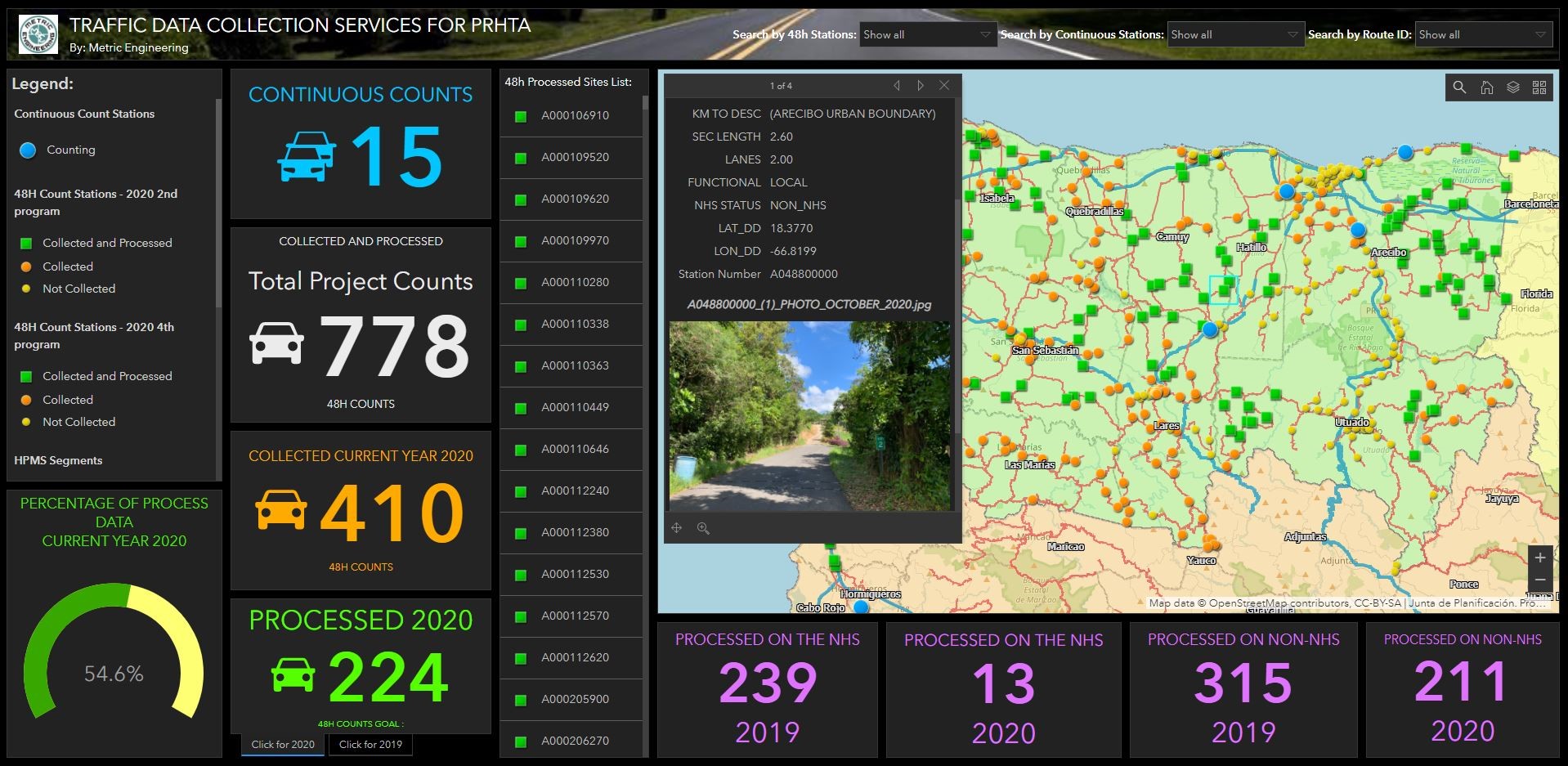
Figure 5. Illustration. DTOP and Metric Engineering’s Traffic Data Collection project displays traffic data information via traffic monitoring devices. The popup window contains detailed information about each data collection site.
Both dashboards replaced spreadsheet-based processes of data collection and maintenance. The location data in both the landslides and traffic monitoring devices as recorded in the spreadsheet had many inaccuracies. As a result, Metric Engineering decided to use dashboards created in ArcGIS Online so that their field crews could use Esri’s mobile collection apps to collect accurate, precise location data. Visualizing the locations on a map interface instead of on a spreadsheet also allows for easier quality control of data collected in the field.
DTOP contracted with Metric Engineering to assess all landslide locations within two months, and Metric Engineering suggested that a dashboard would be the quickest and most efficient way to track their progress and ensure coverage of all landslide locations. For the traffic data collection dashboard, DTOP asked for weekly and monthly progress reports, and Metric Engineering determined that a dashboard could fulfill this need and provide more up-to-date and detailed information than a static report.
Developing both dashboards required collaboration between Metric Engineering and DTOP, and among Metric Engineering’s staff. While development of all Esri-enabled dashboards occurs in Metric Engineering’s design department, the engineering department is responsible for maintaining the data. As a result, the two had to communicate and share data. Additionally, Metric Engineering also trained field crews to collect the data using Esri’s apps. The development team used design features such as multiple-choice questions to avoid confusion among field crews and to ensure accurate data collection. The primary technical challenge that the team encountered is collecting data in areas without cellular coverage. This required manually uploading data stored on phones once field crew returned to headquarters.
Overall, the two dashboards have proven helpful for both DTOP and for Metric Engineering. For DTOP, not only does it supplant older reporting processes, but it also allows managers to track work being done on their team and other performance metrics continuously. It has also enabled better data quality procedures. Metric Engineering offered the dashboards as an added value to their contract work with DTOP, quickly turning the dashboards as important tools for DTOP’s work. DTOP has implemented several other dashboards within the agency. DTOP has found dashboards to be an excellent tool for responding to the many questions about construction progress that DTOP has received in the wake of Hurricane Maria.
↑ Return to Top
↑ Return to Table of Contents
3 Lessons Learned
Agencies may create and use internal and external data dashboards to fulfill multiple objectives. Agencies’ experience with dashboards depends on the purpose of their project, its intended audience, and the availability of agency expertise of required technology. This section of the report features advice and lessons learned from agencies that have used data dashboards, as well as the implications of these findings for other agencies.
3.1 Dashboard Development Process
The agencies interviewed for this case study emphasized the importance of the dashboard development process, from defining the process itself to identifying user-experience needs. When asked to provide advice to agencies seeking to create their own dashboards, interviewees identified common themes, including stakeholder engagement, internal management, and technology.
3.1.1 Identify and include appropriate stakeholders
In all of the cases except for ARDOT, the development team consisted of a GIS department that worked with business owners in other areas of the organization. All interviewees found that it was necessary to include the business owner in the initial scoping phase for access to required datasets, to ensure the final product met their needs, and to achieve buy-in and adoption of the final product. MDT’s stakeholders also included their IT department, which offered insight into the details of producing a highly visible piece of technology, such as ADA requirements. Designating a project manager as the primary person responsible for stakeholder coordination can make the process more efficient and reduce the likelihood of small logistics such as scheduling meetings holding up development.
3.1.2 Manage development timeline and stakeholder expectations
All interviewees reported that stakeholder coordination, including scoping, acquiring data, and incorporating feedback, took far longer than the actual technical development of their dashboards. Often, stakeholder time is limited. Technical development can improve in speed with out-of-the-box tools such as ArcGIS Online’s dashboard templates. Multiple interviewees mentioned that it is important to manage stakeholders’ expectations about the process early on. Some stakeholders may expect that one scoping meeting will be enough to produce the end product. Designing an effective dashboard, however, requires multiple review and revision cycles. Depending on the level of stakeholders’ involvement and availability, the process may take months to over a year.
3.1.3 Create prototypes
Two of the interviewees found success in producing a prototype to allow stakeholders to visualize the end product during their discussion. In MDT’s case, building a prototype with sample data jumpstarted the project and attracted leadership and IT’s attention after the project stalled in the initial discussion phase. MDOT’s team found it helpful to have business owners lay out a simple prototype in a PowerPoint file. Simple visuals can help make communication between developers and stakeholders clear and concrete.
3.1.4 Choose the right technology
All interviewees chose ArcGIS Online’s dashboard applications to create their dashboards. Using out-of-the-box software like this offers less flexibility than developing custom software. However, using ArcGIS Online offered many advantages for the agencies interviewed. All interviewees reported that using the software provided for relatively quick and responsive development. Furthermore, as all agencies had an enterprise license and in-house expertise, they were able to use the technology with no additional cost or staff: ARDOT customized Esri’s dashboard templates through custom icons; MDOT used Esri’s GeoJSON-based options for customizing its basemaps to match Agency cartographic standards; and MDT and ODOT took advantage of Esri’s technical support and tutorials to learn how to use the ArcGIS Online environment.
3.2 Outcomes
The section below highlights the success agencies have achieved after implementing data dashboards, particularly through improved processes for reporting and storing data and increased internal and external stakeholder engagement.
3.2.1 Streamlined existing reporting processes
In all five case studies, the dashboards replaced existing reporting processes that required repetitive, time-consuming processes for gathering, cleaning, and analyzing data. In most cases—including ARDOT’s crash analysis dashboard, ODOT’s asset inventory dashboard, MDOT’s billboard dashboard, and ODOT’s performance management dashboard—the dashboard replaced periodic reports that the GIS team had to compile to fulfill internal requests. In other cases, such as MDOT’s bridge dashboard, MDOT developed the dashboard as part of the Agency’s Federal reporting requirements. Similarly, Metric Engineering’s dashboards were part of their reporting requirements to DTOP. Finally, other dashboards reported necessary information to outside stakeholders, such as ARDOT’s crash analysis dashboard, ODOT’s county mileage dashboard, and MDT’s projects dashboard.
In all cases, replacing these repetitive reports saved staff time by reducing the need for reporting requests. Furthermore, identifying an existing process allowed the dashboard developers to define an audience, purpose, and metrics, and to ensure that their dashboard was as simple and targeted as possible to meet their users’ needs.
3.2.2 Improved data storage and validation
In several of the case studies, including Metric Engineering’s dashboards and MDOT’s billboard dashboards, the dashboard replaced a spreadsheet-based reporting tool. A geospatially-enabled dashboard allows for more accurate and precise collection and storage of locational data compared to storing locations as descriptions as in many spreadsheets. Additionally, using a map to visualize location data simplifies quality control through increased locational accuracy.
3.2.3 Increased engagement with the general public
Many dashboards had additional use cases beyond their primary purpose. For example, ARDOT’s crash dashboard and MDT’s project dashboard—both publicly accessible—resulted in increased engagement with the public, a stakeholder group that had not been considered as primary users in the dashboards design phases. The public used the dashboards to investigate crashes and projects that affected their neighborhoods. Furthermore, in both cases, public interest pushed the agencies to make their communications clearer and increase their engagement efforts through incorporating public feedback, considering the transparency of their data, and persuading other agencies to adopt dashboard usage and reporting procedures.
↑ Return to Top
↑ Return to Table of Contents
4 Conclusion and Next Steps
Dashboards are still relatively new to transportation agencies. However, more agencies are incorporating them into their planning and operations as data-driven decisionmaking spreads and as technologies such as existing off-the-shelf software make it easier to create a dashboard. The agencies profiled here identified and engaged the appropriate stakeholders through meetings, prototyping, and revisions to ensure their dashboards fulfilled the end users’ needs. As a result, all interviewees found benefits to their dashboards, including saving staff time, enhancing agency communication, and increasing public involvement. Dashboards at transportation agencies are an evolving field with great potential to promote USDOT and State DOT strategic goals. As more agencies adopt dashboard practices, there will be even more examples of use cases and best practices to use in creating new dashboard projects.
↑ Return to Top
↑ Return to Table of Contents
Appendix A: Case Study Participants
↑ Return to Top
↑ Return to Table of Contents
Appendix B: Interview Guide
Introduction
Thank you for taking the time today to discuss the topic of data dashboards at your agency. Working closely with FHWA, the Volpe Center is interviewing a handful of State DOTs to discuss the different challenges, best practices, and potential lessons learned regarding how dashboards are developed and used at different agencies. Our objective is to create a case study report that will highlight the range of approaches and practices regarding open data applications that can then serve as a guide to other State DOTs, MPOs, and FHWA.
Background
We’re going to start this interview with some general background information about your office and the data dashboard project.
- What is your role within your agency?
- What department or team was the data dashboard project developed in?
- How many people are in your department?
- How many people were involved in developing the data dashboard?
- Is the same department responsible for maintaining it?
- Before the data dashboard project, what was your agency’s experience with data dashboards?
- What other dashboard(s) does your agency currently use?
Purpose
Next, we’d like to discuss this dashboard project in more detail: first, the impetus for undertaking it, and second, who was involved in the process.
- What problem(s) was the dashboard intended to solve?
- How did your agency previously solve these problems?
People
- When developing the data dashboard, did you engage with stakeholders within the DOT for their input? If yes, who?
- Did you engage with anyone outside the DOT? If yes, who?
- How did you include them in the process?
- Did this project have a champion? If yes, who? And how did they champion the project?
- If they ask, a project champion is “an individual who has the authority to use resources within or outside an organization for completion of a given project. A project champion is chosen by the management to ensure supervision of a specific project right from its initiation phase to its execution phase.”10
Process
Next, we’d like to discuss the process you used for creating the dashboard. First, we’ll cover how you designed the dashboard. After that, we’ll ask about the technical implementation of the dashboard.
- Please describe your process for designing this dashboard
- What Key Performance Indicators did you choose to display on the dashboard?
- If they ask, “Key Performance Indicators (KPIs) are key [quantitative] indicators of progress toward an intended result”11
- How did you select these KPIs?
- What data visualization techniques did you use?
- How did you select these techniques?
- How did you decide on other aspects of dashboard design?
- Aesthetics (colors, font, images)?
- Text, such as instructions for use or descriptions of the data visualizations?
- User experience, such as layout, page organization, and interactivity?
- Describe your process for creating and maintaining this dashboard.
- Did you create this dashboard in house or did you partner with other agencies or the private sector?
- What kinds of technology did you use to create and maintain the dashboard?
- What data sets did you use? Did you need to create any new datasets?
- What activities are required to maintain the dashboard?
- Whose responsibility is it to maintain the dashboard?
- What challenges did you face in implementing the dashboard? How did you navigate them?
- If required, probe further using the following questions:
- What institutional challenges did you face?
- What stakeholder challenges did you face?
- What financial, staff time, or resource challenges did you face?
- What technological challenges did you face?
- Approximately how much did this project cost to develop? How much does it cost to maintain?
Reactions
The interviewees’ projects may be in different stages of development and deployment. For those projects that are not yet fully developed or deployed to the end user, use the alternate phrasing provided where applicable.
- Who are the intended users for this dashboard?
- Who uses the dashboard? (If the dashboard is already deployed)
- Do you have any statistics on the dashboard’s usage, such as Google analytics?
- What have been the reactions of internal and external stakeholders to your dashboard (if accessible to external stakeholders)?
- How do you measure success of the dashboard? What metrics of success do you use?
- Alternate: How do you plan to measure the success of this dashboard? What metrics of success will you use?
- What were your lessons learned for this project?
- Alternate: What were your lessons learned for this project so far?
- Does your agency have plans to create more data dashboards?
↑ Return to Top
↑ Return to Table of Contents
Footnotes
U.S. Department of Transportation
John A. Volpe National Transportation Systems Center
55 Broadway
Cambridge, MA 02142-1093
617-494-2000
www.volpe.dot.gov
DOT-VNTSC-FHWA-19-13
FHWA-HEP-19-032