
Figure 1: I-10 Study Area
| I. Background |
| II. The Arizona Department of Transportation Uses Animation to Explain a Complex Project Alternative |
| III. Use of Visual Impact Assessment in Wellington, Ohio's Grade Separation Project |
| IV. Hoback Junction, Wyoming: The Role of Visuals in Developing the East Segment Environmental Impact Statement |
| V. Appendix A. DOT Interview Guide |
| VI. Appendix B. Non-DOT Interview Guide |
LIST OF FIGURES
II. The Arizona Department of Transportation Uses Animation to Explain a Complex Project AlternativeFigure 1: I–10 Study Area |
III. Use of Visual Impact Assessment in Wellington, Ohio's Grade Separation ProjectFigure 1: Existing alignment looking northeast |
IV. Hoback Junction, Wyoming: The Role of Visuals in Developing the East Segment Environmental Impact StatementFigure 1: Project Segments |
Visualization is a vehicle for collaboration with the public, resource and regulatory agencies, and stakeholders. There have been many recent, successful examples of visualization used to improve the transportation project development process, including enhancing communication among these groups. As a first step toward learning and disseminating some experiences and lessons learned in developing visualization tools, the USDOT Volpe National Transportation Systems Center (Volpe Center), in coordination with the Federal Highway Administration's (FWHA) Office of Project Development and Environmental Review and FHWA's Office of Interstate and Border Planning, developed the three case studies presented here. The case studies are based on a series of interviews with a wide range of people including staff from FHWA Division Offices, state Departments of Transportation (DOT), State Historic Preservation Offices (SHPO), resource agencies, local governments, consultants, and other stakeholders, such as environmental organizations and chambers of commerce (see Appendix A for interview guides).
Case study one, "The Arizona Department of Transportation Uses Animation to Explain a Complex Project Alternative," investigates Arizona DOT's use of visualization during formal public information meetings for proposed enhancements to the I-10 corridor. The second case study, "Use of Visual Impact Assessment in Wellington, Ohio's Grade Separation Project," summarizes visualization's role in helping Ohio DOT quantify the visual impacts of a proposed transportation project. The final case study, "Hoback Junction, Wyoming: The Role of Visuals in Developing the East Segment Environmental Impact Statement," describes Wyoming DOT's effort to better communicate project alternatives to resource agencies and analyze resource impacts through the use of visualization.
It is hoped that these case studies can be helpful to other transportation agencies in identifying effective techniques for enhancing and streamlining the project development process, including public outreach activities, for transportation improvements.
PROJECT BACKGROUND
Phoenix, Arizona is one of the fastest growing regions in the United States. In a 1988 Interstate 10 Corridor Refinement Study, the Arizona Department of Transportation (ADOT) projected that by 2005 portions of Interstate 10 (I–10) would see 250,000 vehicles per day; in actuality, in 2005, traffic volumes exceeded 294,000 vehicles per day. The increased traffic demand is causing the I–10 corridor and the adjacent major streets to become congested during peak travel periods. As projected growth is expected to further worsen congestion issues, ADOT has concluded that improvements to the I–10 corridor are needed to alleviate traffic congestion and support growth demands. In 2002, ADOT began the I–10 Corridor Improvement Study to evaluate capacity improvements on a 14-mile stretch of the I–10 corridor (see Figure 1) from SR 51 in Phoenix to the Santan Freeway (Loop 202) in Chandler.
A number of widening concepts were developed during the alternatives development phase. Through public and agency input the alternatives were narrowed down to two that were recommended for additional study:
The Express/Local Lane concept is a roadway design that separates regional through traffic from local traffic. This road design, which has not been utilized in Arizona before, involves constructing independent roadways to separate regional traffic on express lanes from local traffic on local lanes with transfer ramps providing access between the two at selected locations. ADOT staff believes that creating an express/local lane system would relieve congestion on the I–10 by eliminating the weaving maneuvers that currently occur due to numerous entrance and exit points along the freeway between the I–10/I–17 interchange and the I–10/US 60 interchange. The express/local lane project alternative will double the number of lanes on the segment of I–10 between the SR 143 and the US 60 systems interchanges from 12 to 24 lanes.
THE NEED FOR VISUAL TOOLS
The express/local lane concept is complex and was not one which Arizona residents were familiar with. There was confusion about how the project would separate through traffic from local traffic. When the concept was presented to the public during the early stakeholder outreach meetings it was primarily met with puzzlement. One west Phoenix resident said, "It is mind boggling. It seems to be confusing. I will be glad I will be so old [when it is built] that my kids will have to drive me around."1 Another local resident worried that with so many lanes it would be difficult to figure out how to get off the freeway.2 The confusion expressed during these early meetings convinced ADOT that before conducting formal public information meetings for the Alternatives Selection phase they needed to find a better way to communicate the details of this complex project to the public.
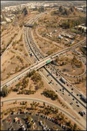 Figure 2: Current Freeway Design |  Figure 3: Proposed Freeway Design |
CREATING THE VISUALIZATION TOOLS
A Public Involvement Team (PIT), a Study Team subgroup comprised of the FHWA Area Engineer and Environmental Program Manager and ADOT and consultant project management, public involvement and environmental planning staff, realized that the traditional communication tools used in public involvement meetings, namely engineering plans and two dimensional renderings, would be inadequate in explaining this complex project to the public. As a result, ADOT's Project Manager for the I–10 Corridor Improvement Study searched the Internet to find examples of how other states handled similar situations. Upon viewing a video simulation used by the Rhode Island Department of Transportation (RIDOT)3 and talking with the video's producers, the Project Manager suggested that ADOT create a simulated animation for the I–10 Corridor Improvement Study project. FHWA Arizona Division also sought feedback from the FHWA Rhode Island Division of the effectiveness of the animations developed for the Rhode Island project.
ADOT worked with its engineering consulting firm and Pineapple Studios, a multimedia production company, to develop a suite of visualizations to simulate how the project area will look if the Express/Local Lane alternative is built. The multimedia consultants created the visuals using engineering plans, project design drawings, photographs of the existing project area and basic computer aided design (CAD) information as the baseline data. Various computer virtual imaging software, including 3D Studio Max, Adobe Photoshop and PhotoModeler were used to create the "after" visual (see Figures 2 and 3). In addition to the photographic renderings, a video animation simulating driving along the proposed I–10 Corridor was also developed to demonstrate how travelers will navigate the regional and local lane system. The photo–renderings and the video animation were compiled to create a DVD, which includes a narrative description of the project.4
INCORPORATING VISUALIZATION IN THE PROJECT DEVELOPMENT PROCESS
The project team utilized the visualizations in each of the three public meetings held for the I–10 Corridor Improvement Study during the alternatives selection phase. The public meetings, which were held in an open house format, began with a presentation on the project followed by a showing of the DVD and then a Question and Answer session. The public was then invited to view the various photo-simulation boards stationed around the room to gather further information about specific roadway segments. A team member was assigned to each station to answer the public's questions. The visualizations displayed at the public meetings were made available through ADOT's webpage for those that were unable to attend the meetings. Having a narrative description of the project included on the DVD ensured that the public received the same information about the project whether they came to a public meeting or viewed the video from the internet.
ADOT noted that, in relation to other projects, this project generated a great deal of interest. Following the public meetings, the ADOT received a number of requests for copies of the DVD, and to date, has sent out about 40 copies to various groups including community transportation departments, fire departments, and special interest groups.
OUTCOMES
The package of visualizations used for the I-10 Corridor Study had a positive impact on the public's understanding of the project. According to ADOT's Community Relations Project Manager, a number of people came to the public meetings with residual negative feelings from a controversial project that is also currently under study in the metropolitan area. ADOT noticed a definite change in attitude from the time participants walked into the public meetings to the time they left. For the Community Relations Project Manager, "It was a very nice experience to see the positive public response. Those who walked into the meeting with a pre–conceived negative impression were, in the end, quite supportive of the project. The visualization techniques contained on the DVD played a big role in that."
The visuals were not only instrumental in addressing those who were skeptical, but also helped to answer questions for those advocating for highway improvements. Transportation is a priority issue for the Phoenix Chamber of Commerce, and as a result, they requested that ADOT present information on the I–10 Corridor project to the association's Transportation Committee. For the Vice President of Public Affairs and Economic Development for the Phoenix Chamber of Commerce seeing the proposed project in the context of its real world surroundings demonstrated that this complex project was achievable in spite of the area's land constraints.
The feedback attained by the public and agency stakeholders for the project's express/local lanes concept provides a level of support in moving forward with detailed analysis of the project alternatives in the Draft Environmental Impact Statement (DEIS). It is anticipated the visualization tools will be utilized again to convey the project concepts during the Public Hearing to be conducted after the DEIS is prepared.
LESSONS LEARNED
There are several lessons learned from Arizona DOT's use of visualization in the I–10 Corridor Study project, in relation to its development and its use.
CONCLUSION
A well–developed visualization can be a powerful communication tool to explain complex projects. As ADOT's Project Manager noted, "if you want to convey information to the public and there is anything that relates to the unknown, visualizations can really help deliver your message." Investing additional time and money to create an effective visualization can help to engage non–technical stakeholders, leading to more robust discussion and increased public support. Following upon the success of using visualizations in the I–10 project, ADOT is considering using the tool in other similarly complex highway projects.
PROJECT BACKGROUND
One of the primary transportation issues in Lorain County, Ohio is the number of at–grade rail crossings on the CSX railroad tracks, which run northeast to southwest through the cities of Grafton, LaGrange, and Wellington. Recent consolidations within the railroad industry lead to a significant increase in the daily number of trains, from a rate of 14 per day to more than 70 a day, with an average of 3 trains per hour. On average, the tracks are blocked for 2 minutes per train, which result in 15 hours of total traffic delay per day.5 This increase in rail traffic, along with concerns about transportation routes being blocked to emergency service vehicles, led the Lorain County Engineer to study potential locations for grade–separated crossings.6 The engineering study identified possible sites in each of the above–mentioned towns where grade separation would be feasible. In Wellington, the feasible grade-separation project is located on State Route 58, north of downtown Wellington and south of a residential neighborhood (see Figure 1).

State Route 58 runs through two historic districts, the Wellington Center Historic District and the Wellington Historic District. Section 106 of the National Historic Preservation Act of 1966 requires that all federally funded, permitted, or licensed projects be reviewed before work commences to determine whether they will affect historic properties. As part of the review, the FHWA must consult with the State Historic Preservation Office (SHPO) regarding the project's affect on historic properties. When the Ohio SHPO initially reviewed the proposed Wellington grade-separation project, they found that it would adversely affect the historic area because it "will introduce new elements in and adjacent to the National Register listed districts�and will thus diminish their integrity, mainly setting, feeling, and association."7 Under the Section 4(f) regulations, an adverse effect finding by SHPO would have resulted in a "constructive use", which would have required an individual Section 4(f) evaluation, a timely and complex process. In order for Ohio Department of Transportation (ODOT) to construct the grade separation in the historic district they would have to prove that there is no prudent and feasible alternative to the using the Section 4(f) resource and that the selected alternative includes all possible planning to minimize harm to the resource.
ODOT had previously ruled out each of the other possible alternatives for grade separation in Wellington - identified during the original engineering study - due to engineering difficulties or because they did not meet the purpose and need of the project. As a result, the ODOT had to address SHPO's adverse effect ruling on the proposed grade-separation alternative.

INCORPORATING VISUALIZATION IN THE PROJECT DEVELOPMENT PROCESS
In order to address SHPO's adverse effect ruling, ODOT needed to employ a systematic and objective method to determine and quantify the project's potential adverse impacts. ODOT needed to better understand and quantify the project's impacts before they could begin to discuss mitigation options. At the suggestion of the FHWA, ODOT undertook a Visual Impact Assessment analysis, a six-step method for quantifying the visual impacts of a proposed transportation project that was developed by the Minnesota DOT and the FHWA.8 The analytic process was previously used on the ODOT Maumee River Crossing project, in Toledo, and its successful application their persuaded ODOT to apply it to their Wellington Grade-Separation project. ODOT contracted with TranSystems, which was already under contract to perform the preliminary engineering and design for the Wellington project, to prepare the Visual Impact Assessment.
VISUAL IMPACT ASSESSMENT
The Visual Impact Assessment is a six-step process for identifying, measuring, and assessing the nature of visual impacts. The six steps are:
Identification of Affected Resources and People (Steps 1 and 2)
TranSystems took aerial and on-site photographs along the existing alignment, and conducted site visits to inventory the existing natural, cultural, and project resources. To determine the existing viewers (neighbors and travelers) within the project area, zoning and land use maps were reviewed for existing residential, retail, commercial, industrial, agricultural, recreational, and civic facilities. In addition, demographic data from the U.S. Census Bureau as well as traffic and rail data from ODOT and CSX were inventoried to determine probable affected parties.
Define Existing Visual Quality (Step 3)
TranSystems assigned each of the resources identified in the previous step as either natural, cultural, or project visual resources, which are the geometrics, structures and fixtures that compose the project environment. Each resource was then determined to be either harmonious or disharmonious to the natural environment, orderly or disorderly to the cultural environment, or as coherent or incoherent with the project environment. TranSystems synthesized the information for each resource and found that overall, although the project area includes many historic resources, many existing structures in the area are inconsistent with the historical feeling of the district. In addition, while the existing roadway geometrics are coherent, the majority of roadway fixtures are incoherent with the project's historical environment.
Analysis of Impacts to Visual Quality (Steps 4 and 5)
Once the visual quality of the existing project area is determined, the next step is to analyze how the proposed project will impact the visual quality. The visual impact assessment found that although the roadway design would be impacted by the loss of its straight-line geometrics, the new alignment "may enhance historic feeling in that several disorderly buildings�and incoherent features including artificial lighting, signage, and rail crossing signals and gates are to be removed along the existing alignment. These features which are considered inconsistent with historic setting will no longer be within the neighbor and traveler viewsheds."9 The impacts to the visual quality by the proposed project were depicted via digital altered photographs (See Figures 1 through 4), as well as an animation simulating driving through the area on the new project alignment.
Mitigate adverse visual impacts and enhance existing visual quality (Step 6)
The visual impact assessment concluded that no mitigation was necessary because there were no adverse effects to the existing cultural visual resources. The proposed alternative provided the least impact on Wellington's historical districts and moves the footprint of the project away from the historic district. The analysis also determined that the proposed project would improve the natural resources of the area by adding additional greenspace. Moreover, the study concluded that the cultural order of the area would be enhanced through the use of context sensitive solutions. "Roadway fixtures, including overhead power and telecommunication cables, poles with street lighting arms and fixtures, roadway signs, and rail crossing signals and gates located north of the historic district are considered inconsistent with the historic setting. Through selection of the preferred alternative, these elements will be eliminated from the traveler viewshed as they proceed to and from the downtown area"10 The new project design will incorporate appropriate fixtures and structural treatment, such as lighting fixtures that are consistent with the existing historic setting, to maintain the visual orderliness and cohesiveness of the environment.
RESOURCES USED IN DEVELOPING THE VISUALIZATION
The creation of the photo simulation and drive thru simulation involved a number of data sources, hardware and software applications.11
Data:
Hardware:
Software:
OUTCOMES
The Visual Impact Assessment Report, which included the impact analysis results, a substantial photolog of photographs from the project area, and a three-dimensional drive through simulation of the new roadway alignment, was shared with the State Historic Preservation Office, accompanied by ODOT's request that they issue a conditional no adverse effect finding. The analysis and visualization tools created through the Visual Impact Assessment, coupled with a visit to the project site, enabled the SHPO representatives to firmly grasp the impacts that the proposed project would create. According to the History/Architecture Transportation Reviews Manager for the Ohio State Preservation Office, "the complexity of this project, in that it involved a complicated grade and alignment change and removal of buildings, made it particularly difficult to visualize in the abstract. The Visual Impact Assessment report and visualization tools really made it clear how the proposed project would affect the area."12 After review of the visual impact materials and a visit to the grade crossing location, the Ohio SHPO felt that the vibrations and air pollution associated with the existing and growing truck and traffic idling caused by the at-grade crossing had greater negative impacts on the historic district than the proposed project would.

The Highway Engineer in Ohio's FHWA Division Office believes "the amount of money spent on developing the visualization tool was money well spent."13 Developing the Visual Impact Assessment and the visualization tools took the consultant 3 months, and amounted to 10 percent of the TranSystems contract cost (and only 0.5 percent of the total project cost). The reversal of the adverse effect finding meant that this project did not "use" a section 4(f) property, and as a result ODOT avoided the time delay and costs that would have resulted from a Section 4(f) review process. Even if the analysis supported an adverse effect, the assessment would have provided critical information needed to develop mitigation measures.
While the main purpose for undertaking the Visual Impact Assessment was to address the adverse effect finding from the Ohio SHPO, ODOT found it to be a very powerful communication tool to use throughout the public involvement process as well. While the visualization did not appease the opponents of the project, it did aid the public in grasping the details. As the project moves forward, the visualization has also been useful to ODOT's real estate personnel in its right-of-way acquisitions by providing a very clear before and after look at the project area.14
LESSONS LEARNED
Following a successful first experience with the Visual Impact Assessment, ODOT plans to utilize the technique on future complex projects; however, in the future, ODOT plans to employ the analysis earlier in the planning process. In addition, ODOT learned detailed and realistic visual representations of the proposed project area helps communicate project implications to a diverse audience. The primary audience for the Wellington grade-separation application was the Ohio SHPO, and therefore, the visualizations focused on capturing the details of the historic district and applied a more basic portrayal of the surrounding area. While it would have increased the cost of developing the animation, the addition of more details, including adding more of the actual buildings and houses located in the area, would have made it a more effective communication tool for use during the public involvement phase.
CONCLUSION
The Visual Impact Assessment helped to streamline the project development process by providing a detailed, objective, and thorough analysis of the visual impacts to Wellington's historic districts of the proposed grade-separation project. This was key to getting SHPO approval for the project, thus avoiding a lengthy Section 4(f) approval process. While the visualization did not make this controversial project more agreeable to opponents, it did provide a powerful communication tool to help explain the complex details so that all stakeholders involved had a firm understanding of the project. Developing the visualization required both time and money but the resulting benefits had a positive net impact on the project development process.
PROJECT BACKGROUND
In 2000, the Wyoming Department of Transportation (WYDOT) initiated a Draft Environmental Impact Statement (DEIS) to study portions of the three highway segments that meet at Hoback Junction near Jackson, Wyoming. A decision was made to separate the project into three distinct segments, Hoback North, Hoback East and Hoback Junction (see Figure 1) due to the segments differing needs, the level of controversy for the solutions, and the proposed construction time frames.15 This case study focuses on the Hoback East project segment.

The Hoback East segment is a 3-mile stretch of Highway 191/189. This segment of the highway traverses a major landslide area. Before spending $15 million on repairing the roadway, WYDOT wanted to address the causes of the landslides. In the past, WYDOT has conducted mitigation efforts for slides but with the Hoback East segment, the depth to bedrock ratio meant that none of the traditional measures would be effective at stopping the slide mass. Therefore, WYDOT proposed two alternatives:
Each of the proposed alternatives had potential environmental impacts, making the Hoback East segment the most controversial component of the project. This stretch of Highway 191 borders the Bridger-Teton National Forest, a roadless area that provides big game habitat, and also lies adjacent to the Hoback River, which is eligible for a Wild and Scenic designation. Due to the extent of environmental resources in the project area, the Forest Service and Wyoming Game and Fish Department are closely involved in the development of the Draft EIS.16 These agencies were responsible for providing information on the existing resources and condition of the environment within the study area, as well as quantifying the resource impacts of the project alternatives.
To help with the environmental review process, WYDOT established a review team, called the ID Team, which was composed of federal, state, and local agency representatives as well as members of interest groups. While the team did not have decision-making authority, it played an important role in reviewing the project development proposals. The ID Team had been meeting for at least two years before a decision was made to explore the use of visualization to aid in presenting the alternatives to the public.
NEED FOR VISUALIZATION
Transportation agencies can face a daunting task of explaining the impacts of complex projects to the public. Often a DOT will rely on engineering plans to inform those interested. But as several interviewees noted, it can be difficult for non-engineers (which includes the vast majority of the public and non-transportation agency representatives) to understand and visualize what the proposed alternatives will look like.
The two-dimensional drawings and plans for the Hoback East project's proposed alternatives did not provide sufficient information to the resource agencies who were responsible for responding to the Hoback East EIS regarding the proposed project's resource implications. In addition, these two-dimensional plans did not provide the ID Team or the public with a clear understanding of the proposed project. In order to better communicate the project alternatives in a manner that would aid the resource agencies in identifying and quantifying the resource impacts, WYDOT decided to authorize the hiring of a consultant to create a visualization tool.
INCORPORATING VISUALIZATION IN THE PROJECT DEVELOPMENT PROCESS
In order to enhance communication and create a better public understanding of the project, WYDOT contracted with a consultant to develop a visualization tool to serve as a conceptual model of the two acceptable build alternatives being considered near the Hoback East landslide. WYDOT provided the consultant with key pieces of data including:
These data, which were delivered to the consultant in DGN (MicroStation format), were imported into 3d Studio Max, to create two visualization products:
 Figure 2: Off Alignment Alternative - Before |  Figure 2: Off Alignment Alternative - After |
According to the Chairman of the Teton County Board of Commissioners, the visualizations made a difference in the review teams understanding of the project proposals. "A real benefit of the visualization was that we were able to react to what we saw, and we weren't just reading about in a report. When you are just reading about something, it is hard to see, and it does not have that much meaning. To actually see how the river will be impacted was very helpful."17
COSTS INVOLVED IN CONDUCTING VISUALIZATION AND IMPACT ON PROJECT SCHEDULE
The cost to produce the visualization products was approximately $40,000. The initial estimate for the environmental impact work was $1 million but has subsequently risen to $2 million for the three separate environmental impact statements (EISs). The estimated cost of construction for this segment is $15 million. Therefore, the visualization will end up costing about 2 percent of the total budget for environmental work. The Teton County Commissioner felt that the inclusion of visualization was cost effective- "I really think this is helpful and that WYDOT should seriously consider using it in other complex projects." WYDOT project manager Jeff Brown noted that "while the cost of the visualization products is small compared to the overall project costs, visualization can be expensive. It is important to develop clear expectations for the outcome of the visualization products."
The creation of the visualization products took about six months. The WYDOT project manager felt that any time potentially lost due to the visualization work was more than made up because the tool helped the other agencies and interest groups better understand the project.
OUTCOMES
There are no easy solutions that address the problem of landslides along this roadway and river corridor. Each proposed alternative will have adverse impacts on this environmentally sensitive corridor. To date, WYDOT has not chosen a preferred alternative. Several of those interviewed have proposed that WYDOT should construct the roadway improvements now and then deal with the landslide issues later when better technology to stabilize the land becomes available.
Although a preferred alternative has not been chosen, one clear benefit of the use of visualization came in helping the governmental agencies better quantifying the impacts of each of the alternatives. As part of the EIS document requirements, the U.S. Forest Service and the Wyoming Fish and Game Department are required to quantify the resource impacts and document specific issues and concerns associated with each alternative. Both agencies were having a difficult time documenting their specific issues, as well as quantifying the resource impacts. The visualization products allowed the agencies to better understand the potential impacts and quantify their concerns.
Several interviewees noted that the regional environmental groups near Jackson often differ with WYDOT or its roadway construction proposals. One state official noted that while the visualization tool did not necessarily make the environmental groups more accepting of the Hoback East project, but it did give people a better sense of what WYDOT was trying to accomplish and increase the comfort factor among reviewers. According to the Executive Director of the Snake River Fund, a non-profit organization whose mission is to promote stewardship of and recreational access to the Snake River Watershed, their group would like to be partners to help find solutions so that both WYDOT's and the environmentalists needs and purposes can be met. This is best accomplished through a better communication of project alternatives- something that visualization, if done correctly, can aid.
 Figure 4: Toe Berm Area - Before |  Figure 5: Toe Berm Area - After |
LESSONS LEARNED
There are several lessons to be learned from WYDOT's use of visualization for this project. Most of those interviewed viewed the incorporation of visualization tools into the environmental process as being extremely beneficial.
CONCLUSION
Visualization tools do not change the merits of the project, but provide a mechanism to help people better understand and grasp what a proposed project will ultimately look like. The more realistic the details that are incorporated into a visual the more effective it can be as a communication tool. While there are added costs to develop visualization products, it often can result in a better-informed public, more robust discussion, and possibly greater trust being established between the DOT and the reviewing public. A representative from the U.S. Forest Service noted "the visualization used in the Hoback East project helped people open up to possible solutions and then see what is feasible. People are looking for solutions, and visualization is key to this process."
Background
Technical tools used
Institutional and Public Participation Issues
Costs, benefits, and lessons learned
Referrals:
Can you provide the names of other people who can provide information from other perspectives- members of the public, environmental agency, environmental advocacy group, regional planning agency, etc.